I blog at NHL Connect, Sporting News, CBS, and ESPN and all have their pros and cons.
They look good, but depending on where they are they're at different spots.
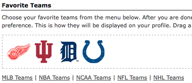
See how in the Welcome area the Red Wings and the Hoosiers have switched positions?

See how in the Welcome area the Red Wings and the Hoosiers have switched positions?

Also I can't move them, ditto for Sporting News. Depending on what page fans are on the logos might look different too.
This is the Blog page.

And this is the Data page.

This is the Blog page.

And this is the Data page.

Moving logos is what ESPN members can do. I put the Red Wings, my favorite team, and hockey, my favorite sport, first.

Depending on the site, where logos appear and the season, I drop the Colts and Tigers so the Red Wings will be first.

Depending on the site, where logos appear and the season, I drop the Colts and Tigers so the Red Wings will be first.
The CBS Sportsline and Sporting News sites fans are locked in as to which sport goes first. That hacks me off.
Anyway I don't get any responses from fans at the four-letter site, but do at the other two. Besides the movable logos is the only thing that's really cool at ESPN.
Look how the "sports leader" totally has the wrong color scheme for the Red Wings.

That's jacked up!
Proving yet again what the four letter thinks of the NHL, look where it appears on the edit screen.

Dead last!
Sporting News also has the wrong color scheme for the Wings, but it's not as bad. Oddly enough the site gets it right on the Hi screen.

Another pet peeve of the News is stars before the screen name. That's a bad design as far as readability is concerned.
The Sporting News add black to the Hoosiers logo, which isn't right either.

I'm also on NHL Connect. That site has some things right. One being it's all hockey!! The blogging area is mediocre at best though, and the coding gets messed up sometimes too. I also can't delete my friends request. Kevin Smith hasn't accepted me yet, after like three months, and since it doesn't look like he will, I'd like to cancel it. Some others who are not so famous have done the same.
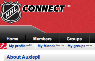
Anyway NHL has my nickname jacked up too. auxlepli should be lowercase, not uppercase.

Look how the "sports leader" totally has the wrong color scheme for the Red Wings.

That's jacked up!
Proving yet again what the four letter thinks of the NHL, look where it appears on the edit screen.

Dead last!
Sporting News also has the wrong color scheme for the Wings, but it's not as bad. Oddly enough the site gets it right on the Hi screen.

Another pet peeve of the News is stars before the screen name. That's a bad design as far as readability is concerned.
The Sporting News add black to the Hoosiers logo, which isn't right either.

I'm also on NHL Connect. That site has some things right. One being it's all hockey!! The blogging area is mediocre at best though, and the coding gets messed up sometimes too. I also can't delete my friends request. Kevin Smith hasn't accepted me yet, after like three months, and since it doesn't look like he will, I'd like to cancel it. Some others who are not so famous have done the same.
Anyway NHL has my nickname jacked up too. auxlepli should be lowercase, not uppercase.


No comments:
Post a Comment