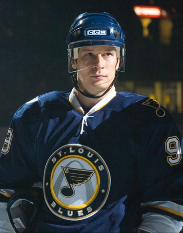
The Blues' jersey looks really sharp. I like it a lot.
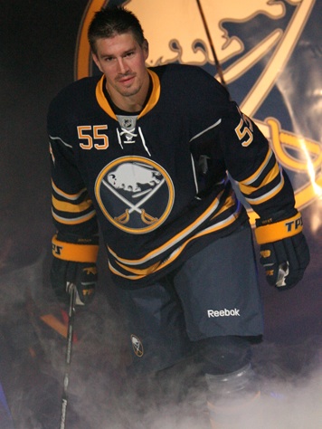
The Sabres' jersey, I'm not feeling it. The piping and the front number ruin it for me.
The old Sabres logo is just ok, nothing great, but it's definitely better than the buffaslug. Frankly I miss the buffalo head logo the organization had in the late 90s, early 00s. I also liked the third jersey, cross sabres logo at about the same time.
I posted earlier today on a message board that I wasn't digging the new tie-up jerseys. I thought the NHL "V" made them superfluous. I see now the way Paul Kariya has his that they are not. I stand corrected.
Still I like with the tie-up jerseys designers are trying for an old school look. Yet with the new, sleek jerseys they don't look right to me.

No comments:
Post a Comment